Set Signup and Dashboard Appearance
Appearance tokens style the customer dashboard, signup, pricing, login, and the template browser. Fields start at the plugin defaults. One save stores every sub-tab, even the ones that are not visible.
Navigate to Waas → Settings → Appearance (/wp-admin/admin.php?page=grabwp-tenancy-waas-settings&tab=appearance).
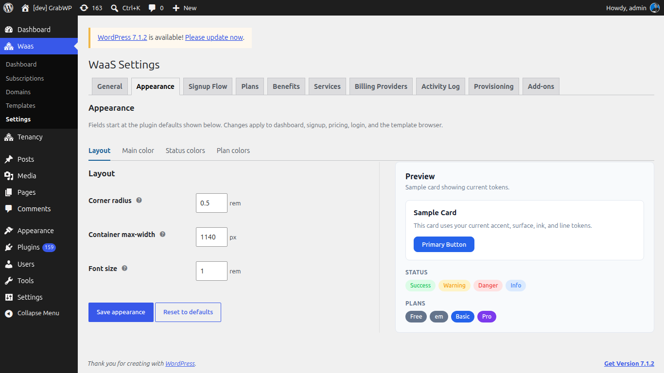
The sub-tabs are Layout, Main color, Status colors, and Plan colors. The Preview column stays visible on each of them.
Layout
| Field | Default | Notes |
|---|---|---|
| Corner radius | 0.5 rem | Base radius from 0 to 2, in steps of 0.05. Smaller and larger corners scale from this value. |
| Container max-width | 1140 px | Widest the page content grows, from 720 to 1920, in steps of 10. |
| Font size | 1 rem | Base size from 0.5 to 2, in steps of 0.05. Other text scales from it. |
Main color
Open Main color.
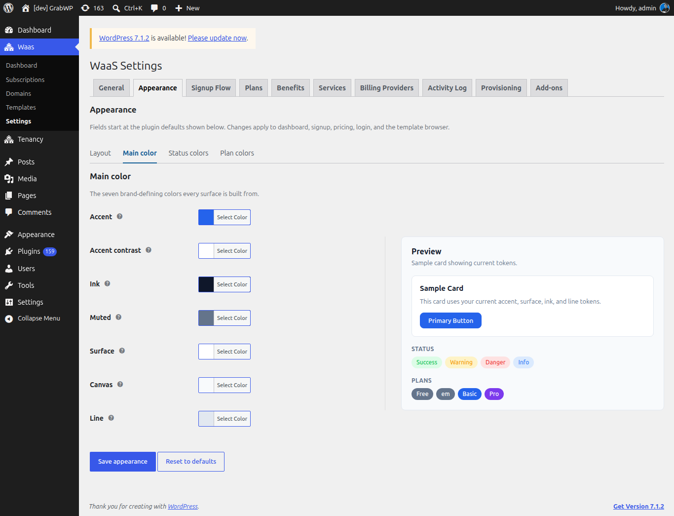
These seven colors are the ones every surface is built from.
| Field | Default | Notes |
|---|---|---|
| Accent | #2563eb | Primary buttons, links, and active navigation. |
| Accent contrast | #ffffff | Text on accent backgrounds. |
| Ink | #0f172a | Main text. |
| Muted | #64748b | Secondary text and hints. |
| Surface | #ffffff | Card and form backgrounds. |
| Canvas | #f8fafc | Page background behind cards. |
| Line | #e2e8f0 | Borders and dividers. |
Status colors
Open Status colors.
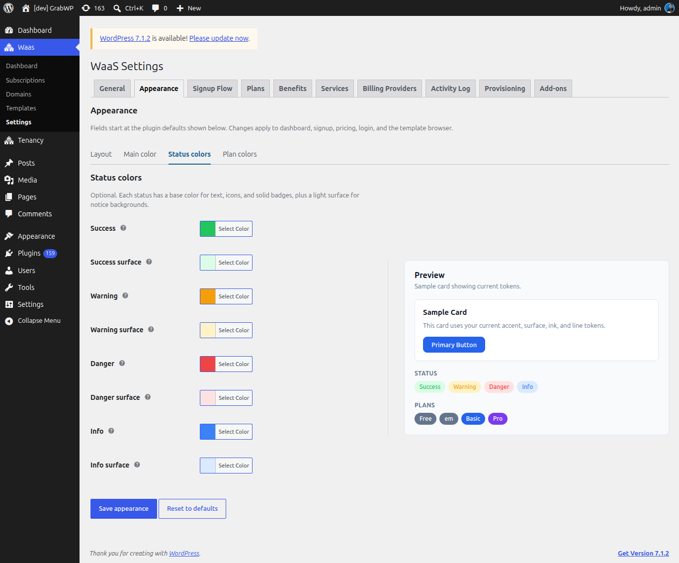
Each status has a base color for text, icons, and solid badges, plus a light surface for notice backgrounds. These fields are optional.
| Field | Default | Notes |
|---|---|---|
| Success | #22c55e | Confirmations, active states, and paid badges. |
| Success surface | #dcfce7 | Light background behind success notices and badges. |
| Warning | #f59e0b | Expiring sites, grace periods, and cautions. |
| Warning surface | #fef3c7 | Light background behind warning notices and badges. |
| Danger | #ef4444 | Errors, destructive actions, and suspended sites. |
| Danger surface | #fee2e2 | Light background behind error notices and badges. |
| Info | #3b82f6 | Neutral notices, trials, and informational badges. |
| Info surface | #dbeafe | Light background behind informational notices and badges. |
Plan colors
Open Plan colors.
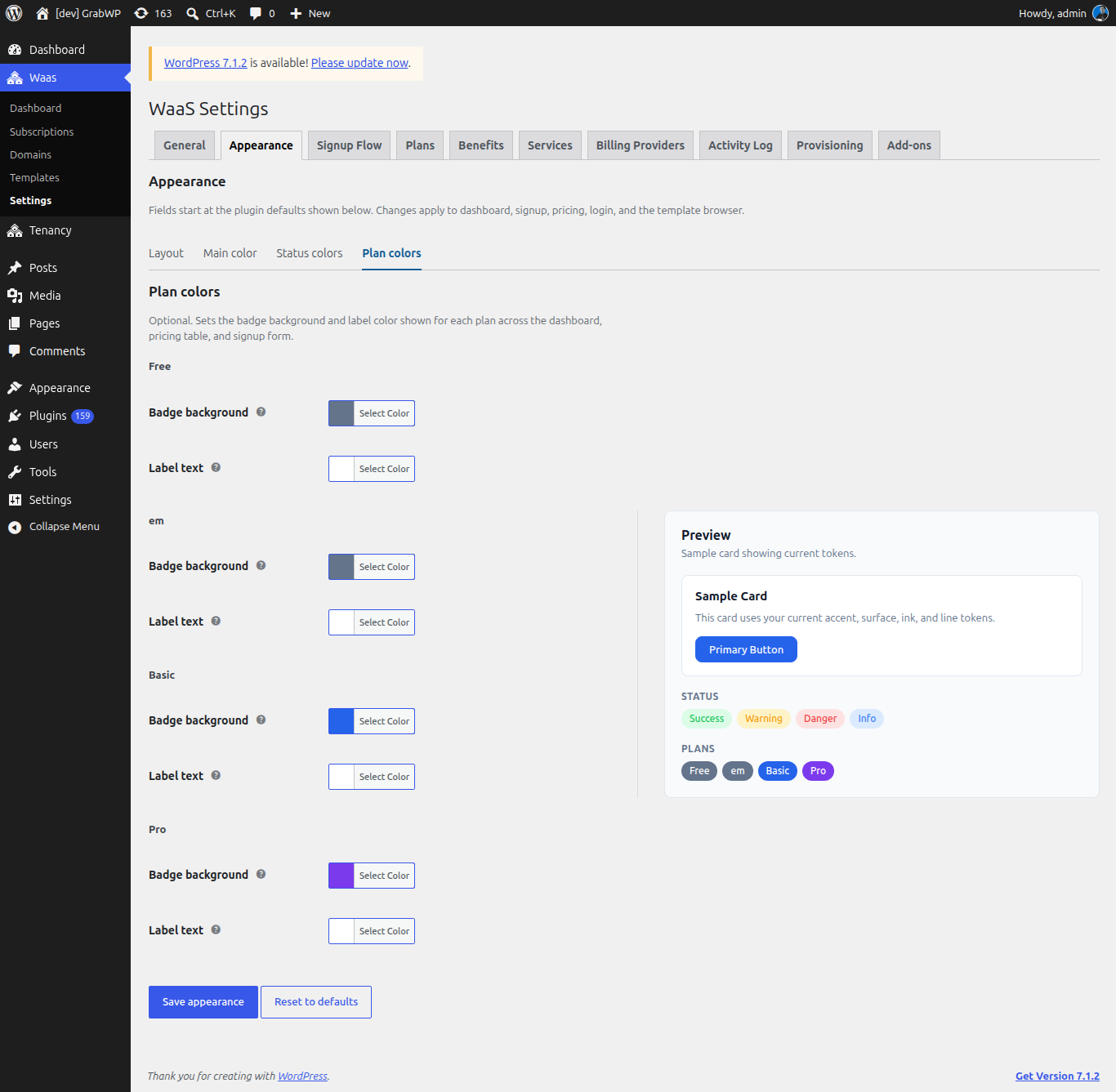
Each existing plan gets Badge background and Label text. The badges show on the dashboard, the pricing table, and the signup form. Create a plan first if this sub-tab says no plans exist yet. See Create Plans.
Built-in starting colors:
| Plan slug | Badge background | Label text |
|---|---|---|
free | #64748b | #ffffff |
basic | #2563eb | #ffffff |
pro | #7c3aed | #ffffff |
| Any other slug | #64748b | #ffffff |
Preview
Preview is titled Sample card showing current tokens. It includes:
- A Sample Card with the line "This card uses your current accent, surface, ink, and line tokens." and a Primary Button.
- Status badges for Success, Warning, Danger, and Info.
- Plans badges, one per plan.
Color and radius changes update the preview before you save. Container max-width is stored with the other tokens and is not drawn inside that sample card.
Save
- Adjust any sub-tab. You do not need to save between sub-tabs.
- Click Save appearance.
Verify: the notice Settings saved. appears, and the signup page or customer dashboard uses the new colors, radius, width, and type size.
Click Reset to defaults to clear your overrides and return every appearance field to the plugin defaults above. Verify: Settings saved. appears and the fields show those defaults again.