Appearance
Short answer: Waas > Settings > Appearance sets the colors, corners, width and text size of everything your customers see from WaaS: signup, pricing, login, the template gallery and the customer dashboard. A live preview shows your changes before you save. It does not change the look of customer sites themselves; their theme does that.
Needs: Pro + WaaS
How it works
- The page has four sub-tabs: Layout, Main color, Status colors and Plan colors. The Preview column stays visible on each.
- One Save appearance stores every sub-tab, so you do not need to save between them.
- The Accent color you picked in the setup wizard is the same value as Accent here.
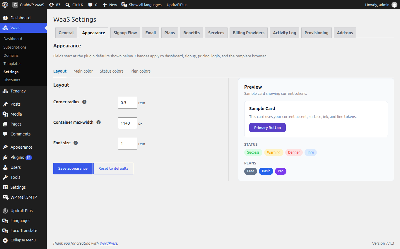
Layout
| Field | Default | Notes |
|---|---|---|
| Corner radius | 0.5 rem | Base radius from 0 to 2, in steps of 0.05. Smaller and larger corners scale from it. |
| Container max-width | 1140 px | The widest page content grows, from 720 to 1920, in steps of 10. |
| Font size | 1 rem | Base size from 0.5 to 2, in steps of 0.05. Other text scales from it. |
Main color
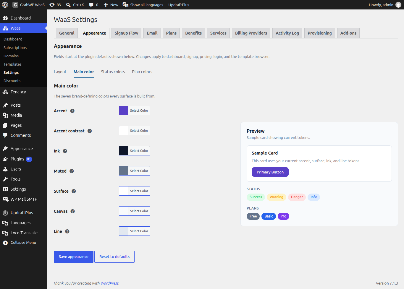
Every screen is built from these seven colors.
| Field | Default | Used for |
|---|---|---|
| Accent | #2563eb | Main buttons, links and the active menu item. |
| Accent contrast | #ffffff | Text on accent backgrounds. |
| Ink | #0f172a | Main text. |
| Muted | #64748b | Secondary text and hints. |
| Surface | #ffffff | Card and form backgrounds. |
| Canvas | #f8fafc | The page background behind cards. |
| Line | #e2e8f0 | Borders and dividers. |
Status colors
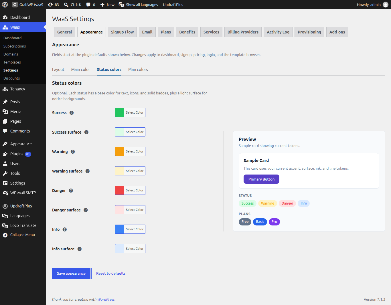
Each status has a base color (text, icons, solid badges) and a light surface (notice backgrounds). These fields are optional.
| Field | Default | Used for |
|---|---|---|
| Success | #22c55e | Confirmations, active states and paid badges. |
| Success surface | #dcfce7 | Background behind success notices and badges. |
| Warning | #f59e0b | Expiring sites, grace periods and cautions. |
| Warning surface | #fef3c7 | Background behind warning notices and badges. |
| Danger | #ef4444 | Errors, destructive actions and suspended sites. |
| Danger surface | #fee2e2 | Background behind error notices and badges. |
| Info | #3b82f6 | Neutral notices, trials and information badges. |
| Info surface | #dbeafe | Background behind information notices and badges. |
Plan colors
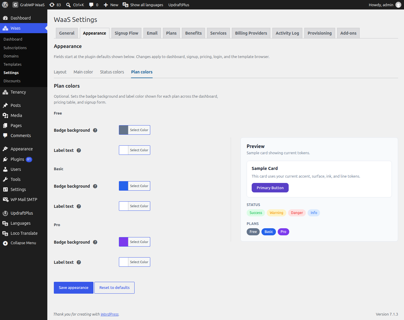
Each plan gets a Badge background and a Label text color. The badges show on the dashboard, the pricing table and the signup form. If the sub-tab says no plans exist, create one first on Plans.
| Plan slug | Badge background | Label text |
|---|---|---|
free | #64748b | #ffffff |
basic | #2563eb | #ffffff |
pro | #7c3aed | #ffffff |
| Any other slug | #64748b | #ffffff |
Preview
Preview is titled Sample card showing current tokens. It shows:
- a Sample Card with the line "This card uses your current accent, surface, ink, and line tokens." and a Primary Button,
- Status badges for Success, Warning, Danger and Info,
- Plans badges, one per plan.
Color and corner changes show in the preview before you save. Container max-width is saved but not drawn in the sample card.
Save or reset
- Change any sub-tab.
- Click Save appearance. The notice Settings saved. appears, and the signup page and customer dashboard use the new look.
Reset to defaults clears your changes and returns every field to the defaults above.
Languages and right-to-left (RTL)
- GrabWP Tenancy, Pro, WaaS and the Sepay add-on include translations for Arabic, Spanish, French, Indonesian, Vietnamese and Simplified Chinese. They follow the WordPress site language.
- Since WaaS 1.1.20, Arabic and other right-to-left languages get a mirrored layout on the customer dashboard, signup, pricing, the template gallery and preview, the WaaS admin screens and the emails.
- To translate plan, benefit and service names, use Polylang or WPML String Translation. The strings are in the group "GrabWP WaaS". To change a specific wording, a plugin such as Loco Translate works.
- On customer sites, right-to-left display depends on the theme and CSS installed on that site.